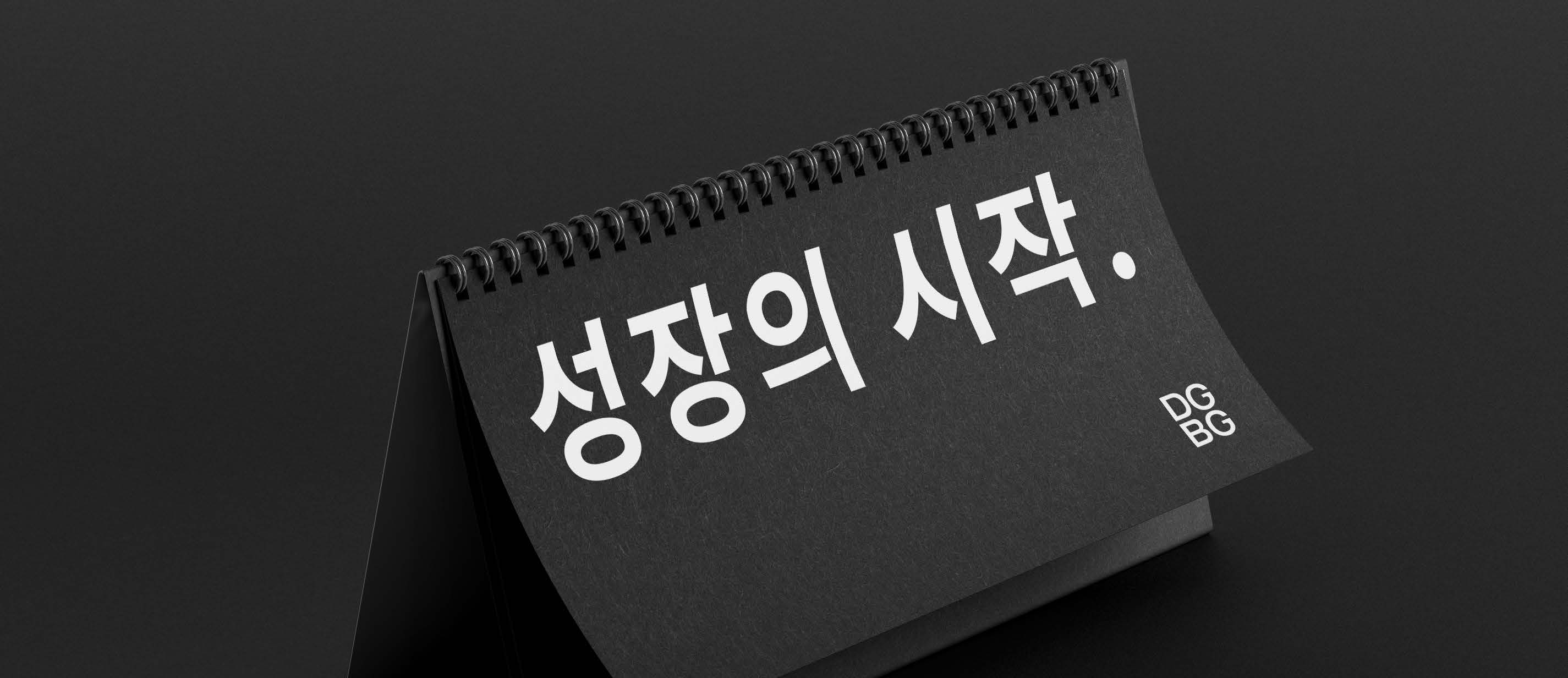
Undertaking a branding initiative for a co-working space client. Collaboratively contributed to about 80% of the Corporate Identity and wholly to the Business Identity, inclusive of desktop UX/UI and web design.
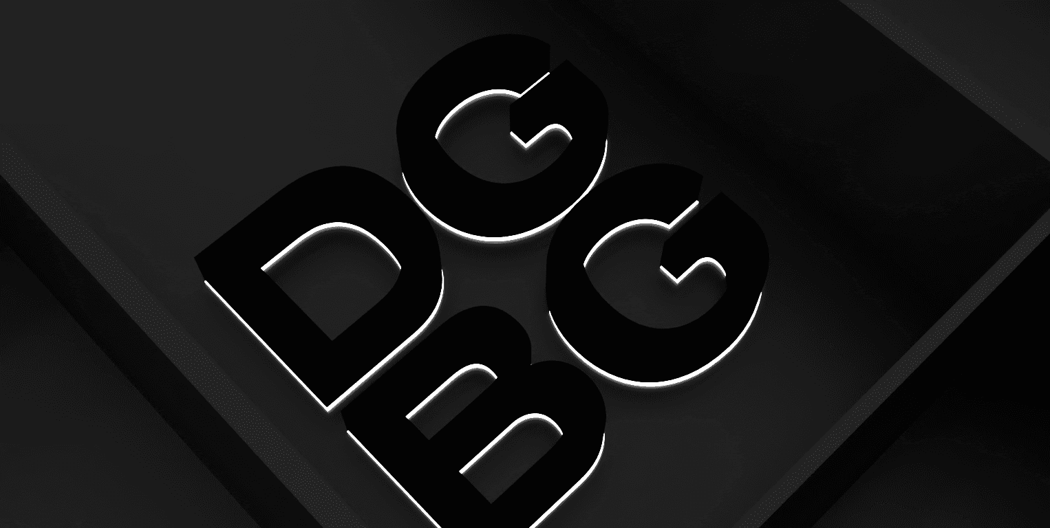
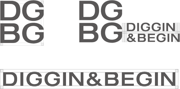
The brand name Diggin & Begin draws from 'digging', signifying excavation, and 'begin', signifying initiation. It encapsulates the chief brand proposition of 'beginning' by 'digging' or grounding the business. The emblem is an ingenious play on the shape of the letter 'G', amalgamating Helvetica, a contemporary typeface, with a timeless serif. It embodies Diggin & Biggin's ethos of carving out novel spaces by diverging from prevalent static notions.